Brand identity
Primary Brandmark
Use the full-color primary brandmark wherever production and contrast allow. The brandmark is approved artwork and must not be redrawn, retyped, recolored or separated into new arrangements.

Custom brandmark
Bespoke lettering — always use the supplied vector or PNG artwork.
Smile accent
The smile swash carries the friendly, optimistic recognition.
Sunshine rays
Radiating linework adds energy and daybreak cues; keep the count and spacing as drawn.
Colors used
Easy Orange, Sprout Green, Ink and White.
Approved brandmark options
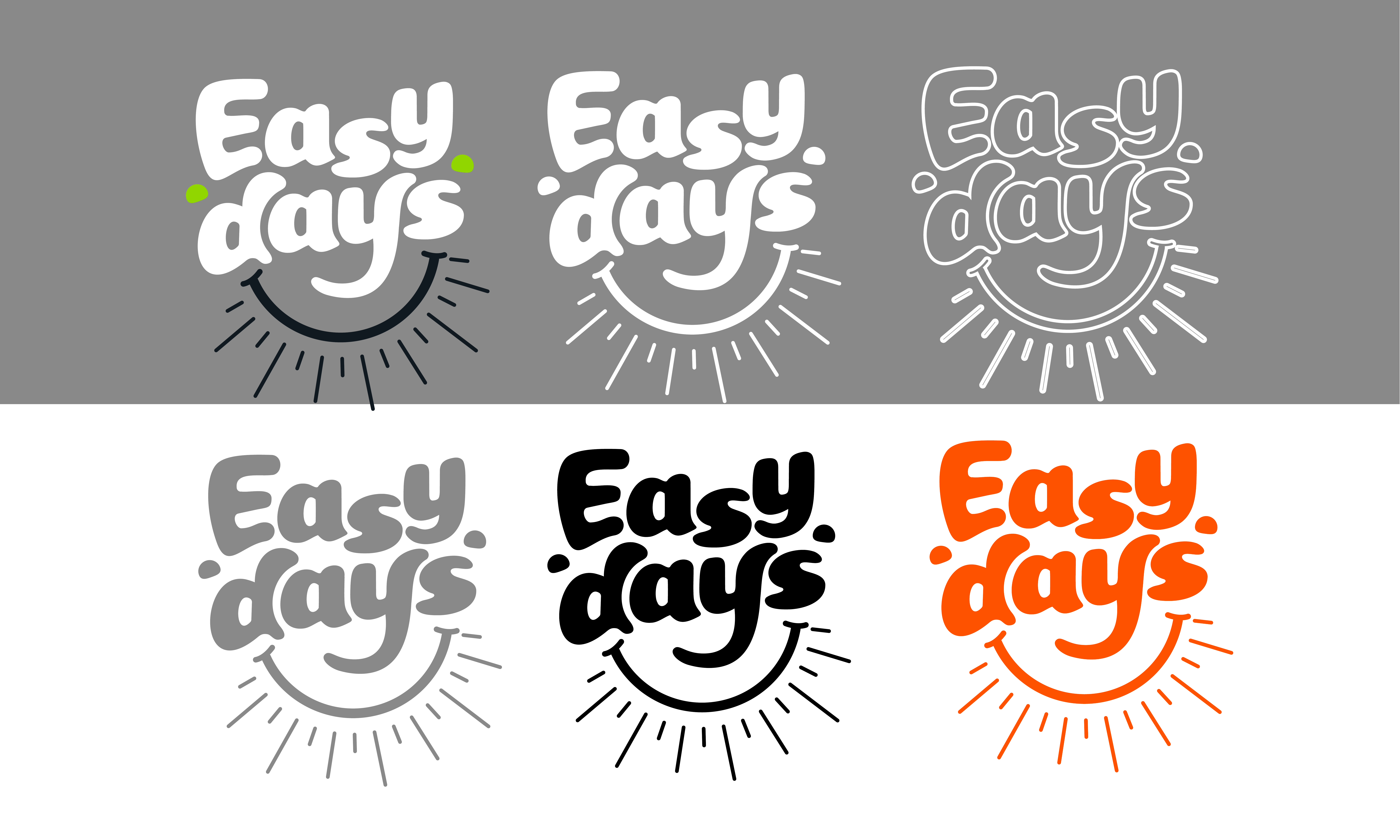
Select the simplest approved treatment that maintains strong contrast. The primary treatment is preferred; single-color and outline versions are production alternatives, not decorative variations.
Full color primary
The preferred treatment. Use wherever production and contrast allow.
Download PNG
Reverse white
For dark fields, photography and ink-heavy packaging panels.
Download PNG
Outline white
Lightweight identifier for busy imagery and video overlays.
Download PNG
Neutral gray
Partner sheets and documents where color is not available.
Download PNG
One color ink
Single-color production: embroidery, etching, one-hit print.
Download PNG
One color orange
Single-color production where Easy Orange is the only ink.
Download PNGClear area
Maintain clear space on all sides equal to at least one green accent-dot diameter (X). Keep text, imagery, trim edges, partner marks and required copy outside this area.
Minimum size
Minimum sizes protect legibility of the custom lettering, green accents and radiating linework. For specialty printing, embroidery or textured substrates, test the artwork at final size before release.
- Full brandmark
- 1.25 in print / 120 px digital
- One-color brandmark
- 1.25 in print / 120 px digital
- Standalone icon
- 0.5 in print / 48 px digital
Do not reduce below these sizes.
Brandmark + icon relationship
The brandmark and icon are two approved assets with different jobs. The brandmark establishes the name; the icon reinforces recognition where space, repetition or format makes a lighter identifier useful. Keep the relationship simple — never place both side by side to invent a new lockup.